

Introduction
Color is one of the most important elements of graphic design. The right colors can make a design attractive, communicate a message, and help a business create a strong brand identity. Whether you are designing a logo, website, social media post, brochure, or advertisement, choosing the right color combination can make a big difference.
In this blog, we will explain color theory, the meaning of different colors, popular color combinations, and tips for choosing the perfect colors for your brand.
What Is Color Theory in Graphic Design?
Color theory is the study of how colors work together and how they influence the appearance of a design. It helps graphic designers select suitable colors to create visually appealing and balanced designs.
Understanding color theory allows designers to create professional logos, marketing materials, websites, and social media graphics that communicate the right message to their audience.
Why Is Color Important in Graphic Design?
Colors do more than make a design look beautiful. They help communicate emotions, attract attention, and make a brand recognizable.
Here are some important benefits of using the right colors:
- Creates Brand Identity: Consistent colors help people recognize your business.
- Communicates Emotions: Colors can influence how people feel about a design.
- Improves Readability: Good color contrast makes text easier to read.
- Attracts Attention: Bright or contrasting colors can highlight important information.
- Builds Consistency: A consistent color palette makes your designs look professional.
Understanding the Meaning of Different Colors
Different colors can communicate different feelings and associations. Their meanings may also change depending on culture, context, and audience.
1. Red
Red is often associated with energy, passion, excitement, and urgency. It is commonly used in promotional graphics, food branding, and advertisements.
2. Blue
Blue often communicates trust, reliability, calmness, and professionalism. It is popular among technology companies, financial services, and corporate brands.
3. Green
Green is associated with nature, growth, freshness, and sustainability. It is suitable for environmental brands, gardening businesses, and wellness-related designs.
4. Yellow
Yellow can communicate happiness, optimism, and creativity. It can help attract attention when used carefully.
5. Black
Black often represents elegance, sophistication, power, and simplicity. It works well for luxury brands, fashion designs, and modern business graphics.
6. Orange
Orange communicates energy, friendliness, enthusiasm, and creativity. It can be a good choice for brands that want to appear modern and approachable.
7. White
White often represents simplicity, cleanliness, and minimalism. It creates space in a design and helps other elements stand out.
What Are the Different Types of Color Combinations?
Graphic designers use different color schemes to create balanced and attractive designs.
1. Complementary Colors
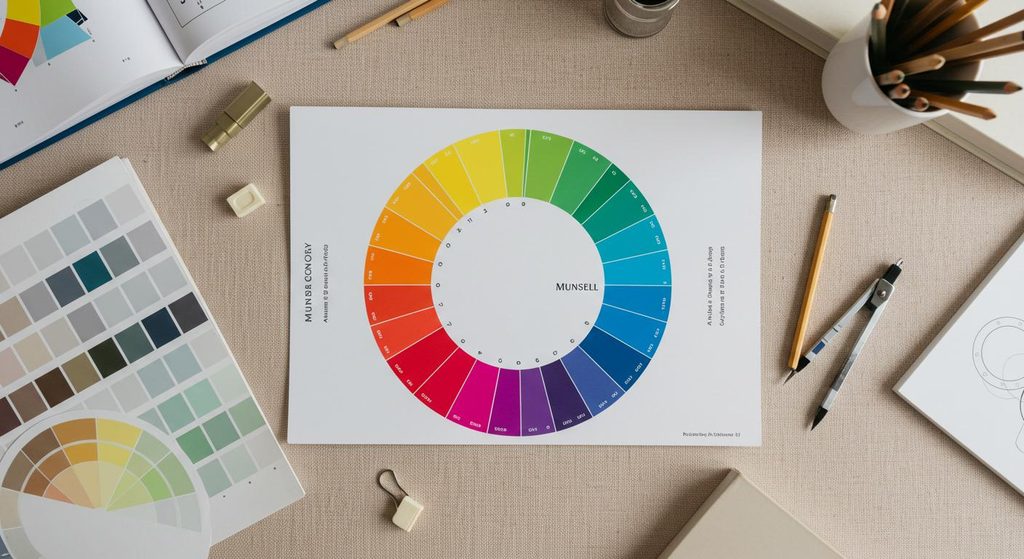
Complementary colors are opposite each other on the color wheel. They create strong contrast and help important elements stand out.
Example: Blue and orange.
2. Analogous Colors
Analogous colors sit next to each other on the color wheel. They create a harmonious and natural appearance.
Example: Blue, blue-green, and green.
3. Monochromatic Colors
A monochromatic color scheme uses different shades, tints, and tones of one color. It creates a clean and consistent appearance.
Example: Light blue, medium blue, and dark blue.
4. Triadic Colors
A triadic color scheme uses three colors spaced evenly around the color wheel. It can create a vibrant and balanced design when used carefully.
Example: Red, yellow, and blue.
How to Choose the Perfect Colors for Your Brand
Choosing brand colors requires more than selecting your favorite shades. Your colors should match your business personality and audience.
Follow these tips:
- Understand Your Brand: Decide whether your business should feel professional, creative, friendly, luxurious, or energetic.
- Know Your Audience: Consider the preferences and expectations of the people you want to reach.
- Choose a Primary Color: Select one main color that represents your brand.
- Add Secondary Colors: Choose one or two supporting colors that work well with the primary color.
- Maintain Good Contrast: Make sure text is easy to read against its background.
- Test Your Palette: Check how your colors look on websites, mobile screens, social media posts, and printed materials.
- Stay Consistent: Use the same brand colors across your logo, website, advertisements, and social media designs.
Common Color Mistakes to Avoid
Even a good design can look unprofessional when colors are not used properly. Avoid these common mistakes:
- Using too many colors in one design.
- Choosing text and background colors with poor contrast.
- Ignoring your brand’s personality.
- Using inconsistent colors across different platforms.
- Following trends without considering your target audience.
- Using bright colors everywhere without creating visual balance.
A simple and consistent color palette often creates a stronger visual identity than a design with too many competing colors.
Best Tools for Choosing Color Palettes
You do not have to choose colors without help. Several online tools can make the process easier.
- Adobe Color: Explore color wheels and create coordinated color palettes.
- Coolors: Generate and explore color combinations quickly.
- Canva: Apply colors to social media posts, presentations, and marketing graphics.
- Color Hunt: Discover curated color palettes for creative projects.
These tools can help beginners and professional designers experiment with color combinations.
Conclusion
Color theory is an essential skill for every graphic designer. It helps you create attractive designs, communicate messages clearly, and build a recognizable brand identity.
By understanding color meanings, exploring different color schemes, maintaining contrast, and using consistent brand colors, you can improve the quality of your graphic designs.
At Teeauras, we believe that thoughtful design choices can help businesses build a stronger visual presence. Whether you need branding, graphic design, or digital marketing support, choosing the right visual style is an important step toward professional growth.
Ready to improve your brand’s visual identity? Explore the creative and digital services offered by Teeauras.